Liam Richardson
I am a creative, forward-thinking senior UX designer with a speciality in transforming large-scale software into beautiful experiences that users love. Since beginning my career in 2013 I have implemented rock-solid user experience workflows into small to medium-sized development teams that have tangibly improved their products for the better, increasing retention and user satisfaction without interfering with pre-existing workflows or strict deadlines. I am looking for my next challenge and am seeking a team that shares my enthusiasm for software design.
With examples. Obvs.
Step One
Because of course it does. A great user experience is built upon a foundation of research. Quantitative. Qualitative. A pool of knowledge that is carefully documented and shared across the wider team using software such as Notion. UX doesn’t begin and end with the UX team. It’s communicated to everyone. Developers. Management. Sales.
Even before a formal UX process is implemented, I gather research from a variety of readily available sources. Internal analytics. Observation software such as MS Clarity or Pendo. Competitor analysis. Articles. Books. I pick up the phone and I talk to users. I send them feedback forms. I ask them about their lives.
And when I have a clear picture, I transform it into clear deliverables that communicate those findings. Personas that give names to user groups. User flows. These documents serve as a base for all activities moving forward. They help the team understand who they are building software for, not just why.
Deliverables
Documents that detail specific user groups. They give these groups a name and a face. They communicate their unique behaviours. They provide a shorthand for the team when discussing new functionality and user flows.
How are our users currently using our software? Can we identify issues? Problem areas? What is their emotional journey? How do they feel? I assign personas to these flows to better understand how each user group interacts with our products.
Step Two
Working closely with stakeholders and key members of the team, it’s time to work out what our next priority is. Have we identified a problem area? A sticking point for a user group? Or maybe we’re looking to implement a new piece of functionality. Whatever the case it’s time to learn more. It’s time to test.
Usability testing is the process of observing a user interacting with our software to identify areas that can be improved. I specialise in three distinct methods, which I have detailed in the “methods” area of this section.
I’m cheating here slightly for the purposes of linearity. User testing doesn’t always sit at this stage in the process. For new functionality, I may knock together some wireframes first and then test using those. Or a high-quality Figma prototype using components from our design system. I may test a competitor's application, to identify issues we need to avoid. I also like to test a piece of functionality after we have fully developed it but before it has been released, to ensure that we’ve done the best job possible.
Methods
We incentivise users (or those completely unfamiliar with our software) to visit us in the office. I sit in the room with them and ask them to perform a series of tasks using our software. These tasks are specially designed to gently guide them through our software so we can test specific interactions and flows. I ask the participants to talk me through their thoughts and feelings throughout the session. These tests are recorded, or better yet, broadcast live to key members of the wider team so they can see first-hand how our software is being used by real people. These tests are invaluable for understanding how users interact with our products.
View an example test scriptSame as above, but conducted remotely. I tend to gather participants using tools such as User Testing.
There is a case to be made that in some instances, an unobserved usability test is the best course of action. For starters, the lack of an observer removes external influence, allowing the user to interact with software more naturally. These tests can also be conducted at scale, which can be useful for checking new functionality or improved flows. I favour using software such as Maze for these particular tests.
Not a method as such, but something I rely on quite heavily. Sketching out an idea and presenting it to a colleague without context. What do you think this is? What would you click? What would you change? It's simple but effective, and a great way to quickly sense check ideas before you even touch a mouse and keyboard. Collaboration, I believe, is essential.
Step Three
Not many companies use a centralised research repository. Honestly, I get it. They are the first to be cast to the wayside as they can be time-consuming to maintain. But for big pieces of software, research repositories are essential for creating a cohesive product that functions consistently.
Using tools such as Notion (or Dovetail, which is shiny and easy to understand) I take all of the data collected within the first two steps of this process and document it. I tag clusters of feedback, to create a list of issues that need to be addressed. I link it to other pieces of research. I revisit it in subsequent research tasks. The goal is to create a paper trail for every decision. Why do our dropdowns look like that? Because this user test confirmed it worked.
I’m also a firm believer in reporting back all findings to the wider team via short presentations or clearly written reports. How many users struggled to find the account button? How many expressed they wanted to click an image expecting it to be a button? Who understood the wording of the login page? It benefits everyone to understand the thinking behind each decision.
Deliverables
Clear documentation makes everyone's lives easier. I don't work in a silo. UX is a collaborative discipline, and I ensure everyone on the team has access to my findings. After all, what if someone else has the answer I'm struggling to find?
It doesn't sound very sexy, and sometimes it isn't. But it pays off to invest people in the process. The more the team understand the needs of the user, the more excited they are to fix issues or come up with solutions.
Case Study
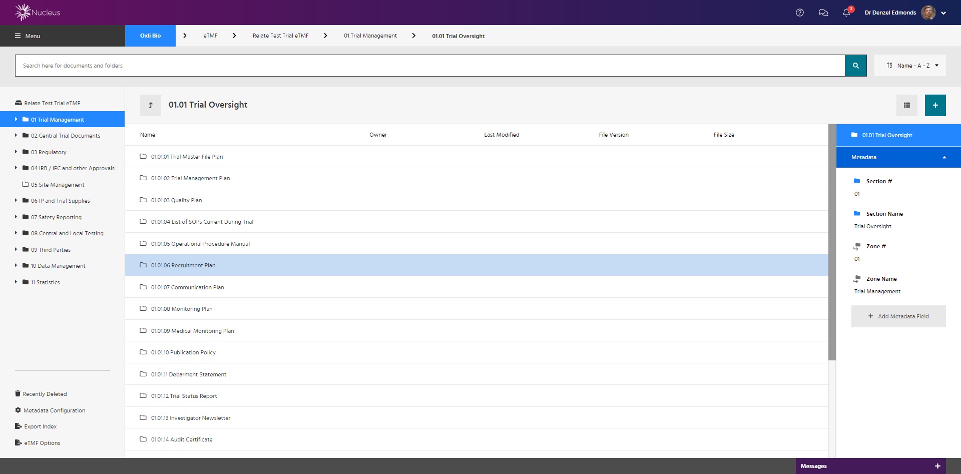
I spent six lovely years at Datatrial, a company that specialised in the development of software for the clinical trial industry, as their head of User Experience and Design. It was my job to oversee the design of their entire software output, including Nucleus, a platform that allowed companies to manage their clinical trial from inception until long after their product was available to consumers.
Nucleus was created, improved and maintained using every step in the process I have detailed on this site. Nucleus was a challenging project. Clinical trial software is traditionally archaic, led by functionality and software limitiations. Nucleus was user focused and stood out as a result. It was delivered using agile methodology, on time and within office hours. Our users loved it, and it received multiple awards including Innovation of the Year.
I was proud to work alongside my team of talented UX and UI designers to deliver something truly special.
Learn moreStep Four
Now for the fun bit. We have all the data. We understand what users want. But what do they need? Forget Figma. It’s time to get out the pens. The paper. The post-it notes. This is the time for experimentation. Informed by research, what can we do that’s different? What can we do that hasn’t been done before?
Then, it’s time to prototype. Advanced user flows. Lo-fi wireframes. Quick deliverables that communicate a solution to a tangible problem.
Deliverables
I make an effort to understand modern technology stacks to better explain concepts to development teams. Advanced user flows clearly detail each step of a journey in without compromising the all important user experience.
View an example flowAn easy way to communicate ideas and demonstrate flows in a real-world context. For tricky projects, wireframes can be tested using actual hardware such as phones or laptops. I find that users still behave realistically even when faced with a rudimentary prototype.
Step Five
I love designing. Websites. Systems. It is something I have been obsessed with since I was a teenager, spending my evenings making blogs about my favourite video games using tables.
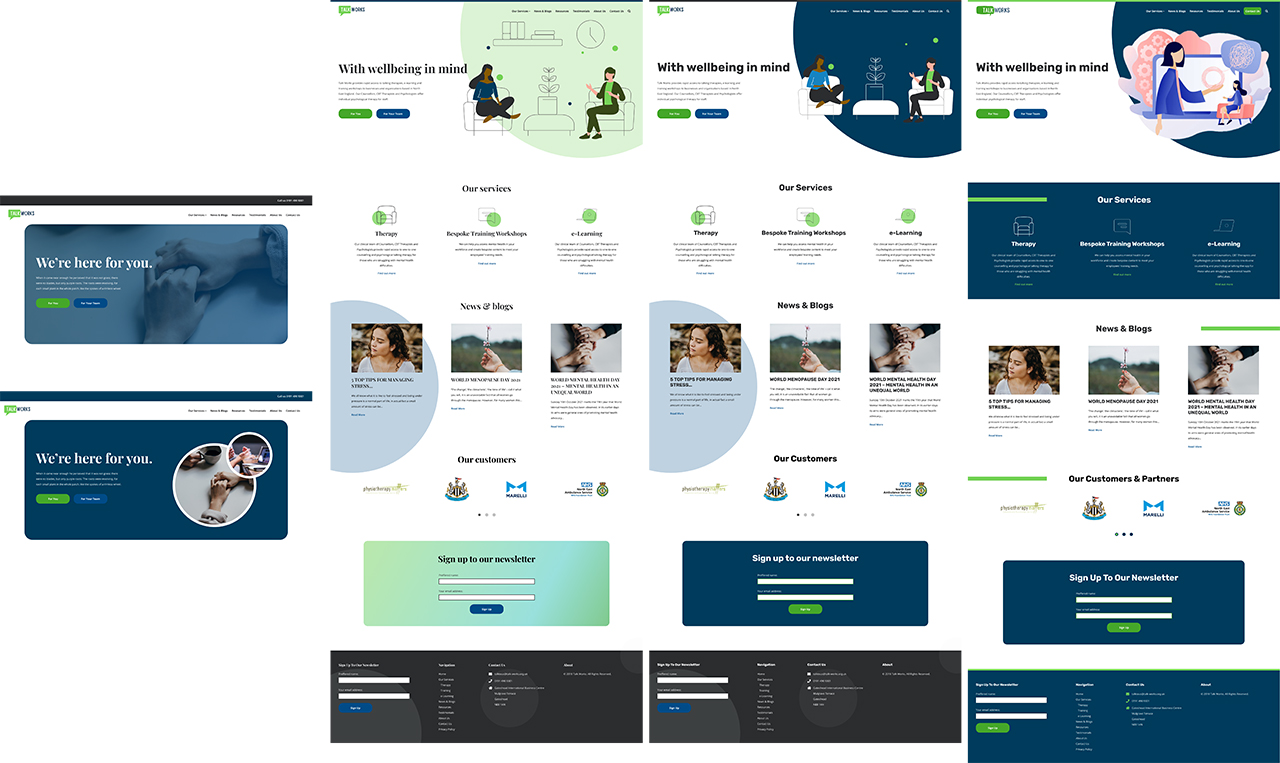
These days, my designs are informed by research. Using Figma, I construct and maintain a detailed design system. Thanks to components, I can comfortably drag and drop reusable blocks with the understanding that they have been created as the result of rigorous user testing and collaborative design processes.
Like the research repository, the design system is clearly documented making it easy for other team members to use.
Oh, and it all looks beautiful. But I hope that goes without saying.
See more design examplesStep Six
I don't just hand over designs to development teams. Where's the fun in that? I involve them in every stage of the process, so when they recieve those designs, they understand the decisions behind every pixel. If any problems arise, they feel comfortable knocking on my desk to ask me questions. And when they're done, we revisit those original designs to make sure they still make sense. If they don't? We check, with another round of user testing, only this time we use functional code.
Skills
I began my career as a .net developer, and have mantained a baseline knowledge of PHP over the years. I understand the basics of programming languages, which helps when communicating with the experts.
I enjoy coding in HTML and CSS (well, SASS, I'm not a heathen) and have continued to build websites in a freelance capacity since transitioning to a more design and research based role. I will sometimes knock together prototypes in HTML, if I think it would help communicate an idea.
Step Seven
The UX process never ends. When the sprint finishes, I go back and I do it all again. Only this time the design system is up to date, and the research repository is full of useful answers. I'm not the type of person to bounce from job to job. I love to work on one piece of software for years, enhancing it and polishing it based on a rich repository of research that reflects our users accurately and fairly.